Risk Analysis Dashboard
The Risk Analysis Dashboard provides a real-time overview of authentication risk across your environment. It aggregates risk events, highlights anomalies, and surfaces the users, IPs, and applications that pose the greatest threat — all in a single view.
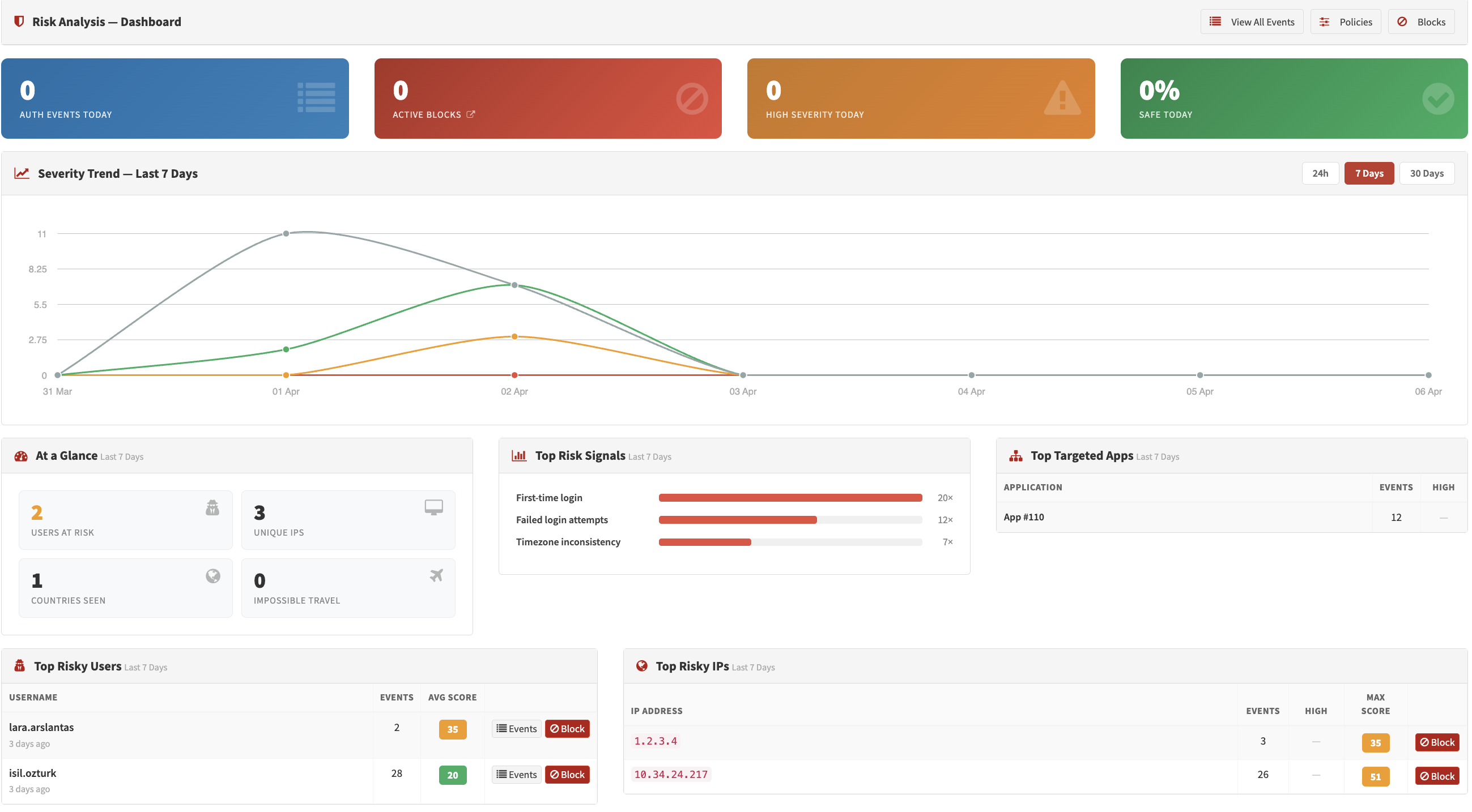
Risk Analysis Dashboard — Summary cards, trend chart, and signal distribution
Time Range
All charts and metrics on the dashboard respect a global time range selector:
| Range | Cache Duration |
|---|---|
| Last 24 Hours | 5 minutes |
| Last 7 Days (default) | 15 minutes |
| Last 30 Days | 30 minutes |
Summary Cards
Four cards at the top of the page always reflect today's data, regardless of the selected time range:
| Card | Description |
|---|---|
| Active Blocks | Number of currently active risk blocks (IP or user blocks that have not expired) |
| Today's Risk Events | Total number of login attempts evaluated by the risk engine today |
| Today's High-Severity Events | Events scoring ≥ 100 (High severity) today |
| Today's Safe Login % | Percentage of today's logins that scored below 30 (Safe) |
Metric Tiles
Six tiles below the summary cards reflect the selected time range:
- Unique IPs — Number of distinct source IP addresses seen
- Unique Countries — Number of distinct countries observed
- Impossible Travel Events — Logins flagged as physically impossible based on location change speed
- Unique Users at Risk — Users with at least one login scoring ≥ 30
Score Distribution
A breakdown of all events in the selected range, grouped into the four severity bands:
- Safe — Score < Low threshold (default: < 30)
- Low — Score ≥ Low threshold (default: 30–49)
- Moderate — Score ≥ Moderate threshold (default: 50–99)
- High — Score ≥ High threshold (default: ≥ 100)
Trend Chart
A time-series chart showing the volume of risk events per severity level over the selected range:
- 24h range — One bar per hour
- 7d / 30d range — One bar per day
The four series (Safe, Low, Moderate, High) are stacked, making it easy to spot spikes in high-risk activity.
Top Signals
A bar chart showing the 8 most frequently triggered risk signals within the selected range. Each bar represents how many events included that specific signal. This helps identify which threat patterns are most active in your environment (e.g., new_country, failed_attempts, known_vpn_asn).
Top Risky Users
A table listing up to 10 users who have generated the highest-scoring risk events (max score ≥ 30) in the selected range:
| Column | Description |
|---|---|
| Username | The user identifier |
| Event Count | Total risk events in the period |
| Max Score | Highest single score recorded |
| Avg Score | Average score across all events |
| Last Seen | Timestamp of the most recent event |
Top Risky IPs
A table listing up to 10 source IP addresses with the most concerning activity:
| Column | Description |
|---|---|
| IP Address | Source IP |
| Country | Resolved from IP geo database |
| Max Score | Highest single score from this IP |
| High Events | Number of High-severity events |
| Avg Score | Average score across all events |
Top Targeted Applications
A table listing up to 8 applications that have received the most risk events (score ≥ 30):
| Column | Description |
|---|---|
| Application | Application name |
| Events | Total risk events in the period |
| High Events | Number of High-severity events among them |
Use Cases
Incident Response
Use the Top Risky Users and Top Risky IPs tables to quickly identify accounts or sources requiring immediate attention.
Trend Analysis
Compare the Trend Chart across time ranges to distinguish one-time spikes from sustained attack patterns.
Signal Tuning
Review the Top Signals chart to see which signals fire most often. If a low-risk signal accounts for a large share of moderate events, consider adjusting its weight in the risk policy thresholds.
Compliance Reporting
The dashboard time range filters and metric tiles provide point-in-time summaries suitable for periodic security reports.